
as our ocean warms
“As Our Ocean Warms” is an infographic and information design which strives to relay how our oceans are reacting to climate change. This includes discovering initial links as to why the ocean is heating, seeing why sea levels are rising and investigating the impacts on marine and coastal eco systems.
The three information designs which are shown through this infographic are glyphs (multivariate), pie chart and finally a node-link relationship design (multivariate). This design is intended to be displayed in a newspaper or magazine i.e. National Geographic and respectively the audience would be anyone who would engage in this platform. It is made to cover general knowledge of climate change whilst providing insights between impact and cause. The general nature of the design is to cater for all readers.
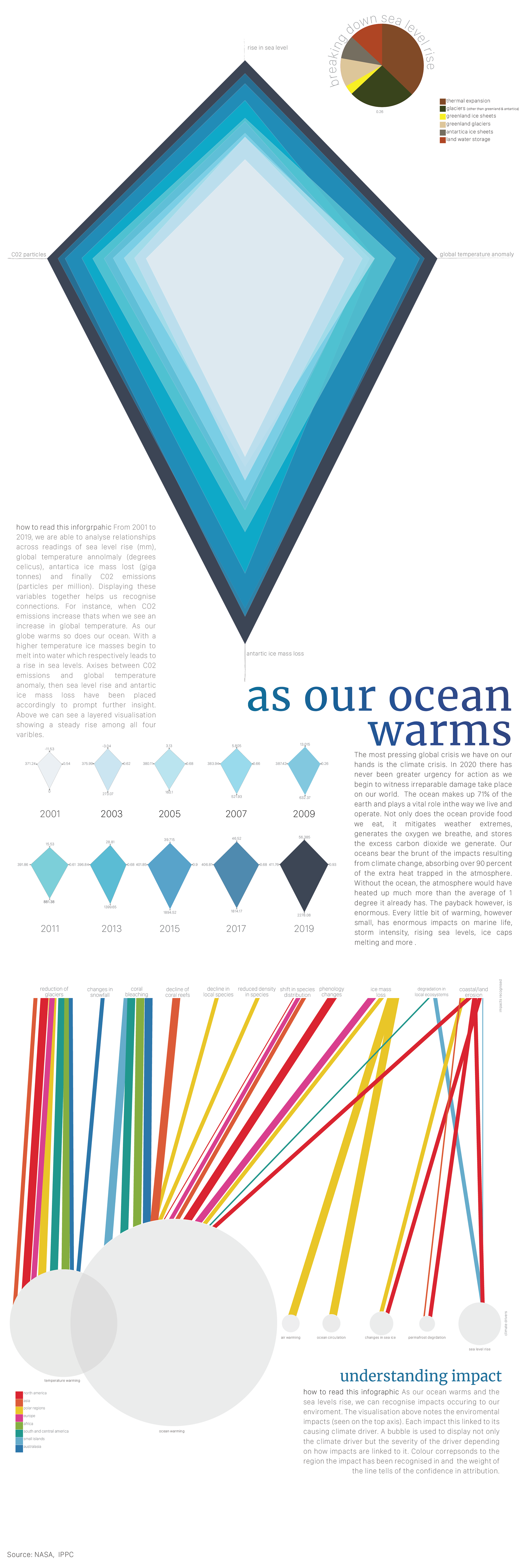
The information design embedded within the infographic were created in Adobe Illustrator using data provided by NASA and the IPCC. The infographic was collated and edited in Adobe InDesign.


